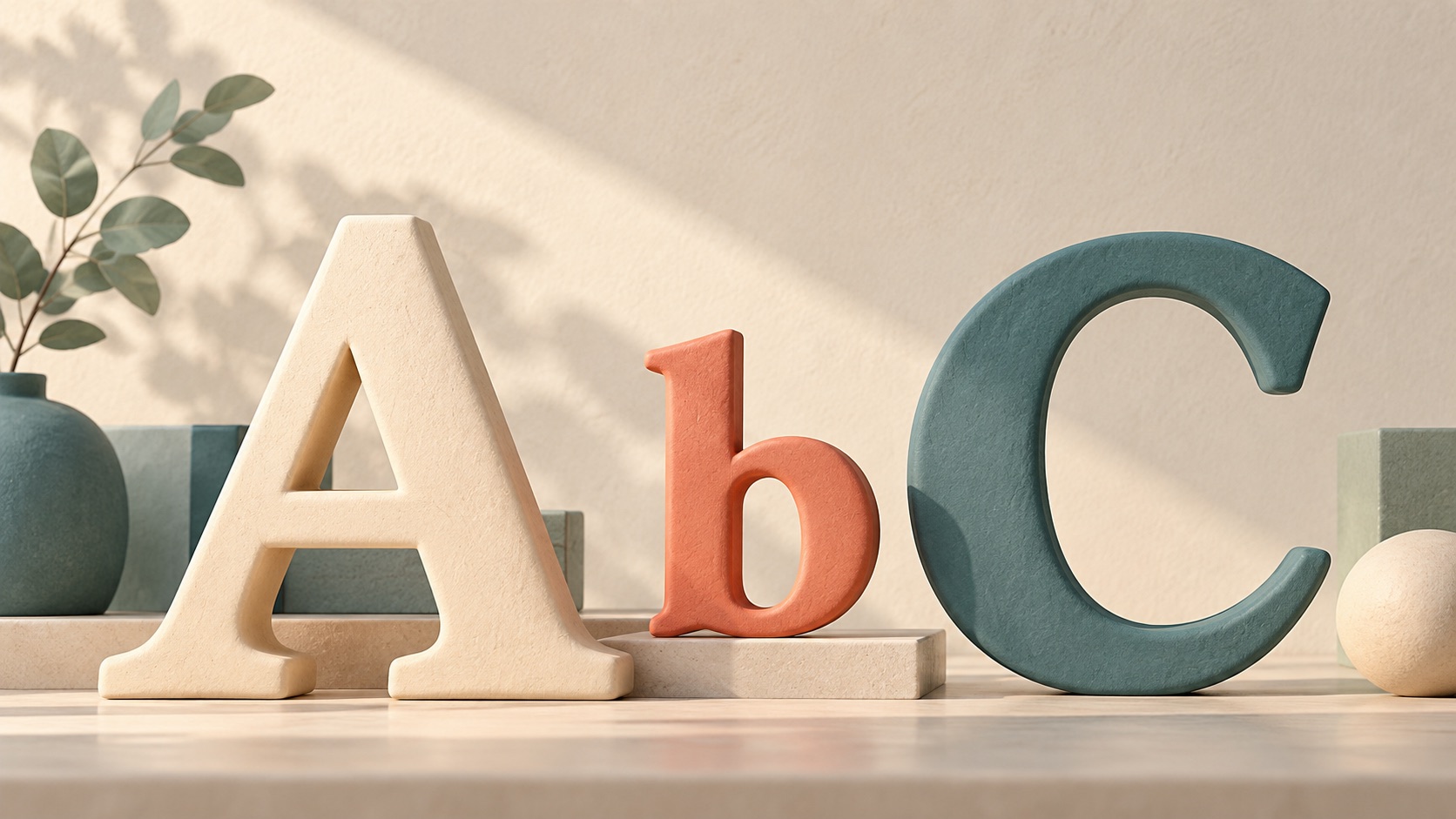
Typography is the way written words are arranged and styled so people can read them. It includes choices like letter shape, size, weight, color, and the space between lines. Think of it like handwriting on a sign: the words matter, but their appearance also affects how easy they are to read.
On a website, a large heading helps a reader spot the main idea, while smaller body text carries the details. Clear spacing can keep one paragraph from blending into the next. These choices should make information easier to follow, not just look decorative.
When building a page, start with text that is comfortable to read on a phone. Then use a small set of consistent sizes so headings and paragraphs are easy to tell apart.