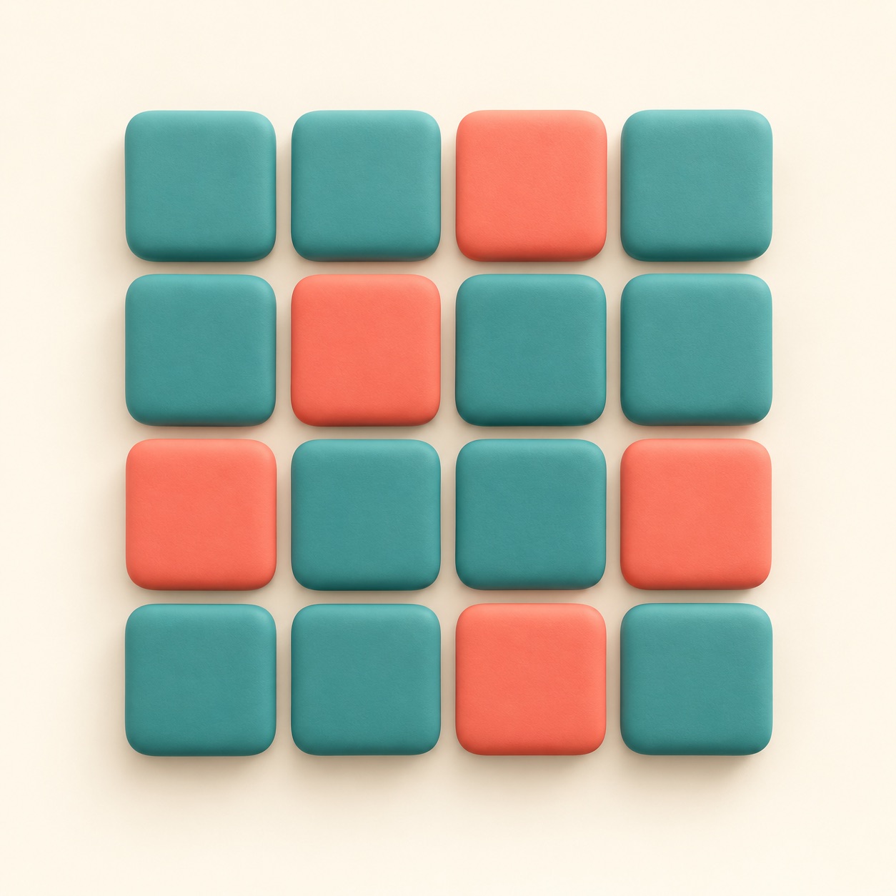
CSS Grid is a way to place webpage items in rows and columns. It is like a tray with compartments: each item can sit in a chosen space, and the whole arrangement can adapt to the screen.
A gallery might show three cards across on a wide display and fewer across on a narrow phone. Grid lets the designer describe those rows and columns without manually positioning every card.
Use it when a layout needs two directions at once. For a simple row of buttons or a vertical stack, a more basic arrangement can be easier to manage.