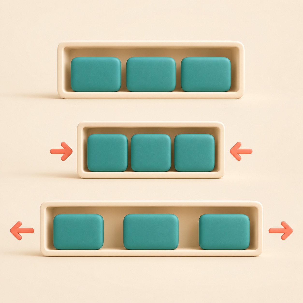
Flexbox is a way to line up items in a row or column and let them adjust to the space available. It is like arranging cups on a shelf that can shift apart or share room as the shelf changes size.
For example, a row of navigation links can stay aligned when the window gets wider or narrower. Flexbox can also center an item or place a button at the far end of a row.
It works especially well for one direction at a time: across or down. For a layout that needs rows and columns together, a grid may be a better fit.